“Features in Dimensions added further value to the project. Citation data and Altmetric scores give insight to the popularity of the published research.”
Erasmus University Rotterdam
Erasmus University Rotterdam (EUR) has embarked on a new strategic initiative to make a positive societal impact through research, as measured by the Sustainable Development Goals (SDGs). Created by the United Nations and accepted by many institutions, the SDGs consist of 17 different goals aimed at improving education, health, environmental issues, hunger, and other areas contributing to a more just and healthy world. To kick off this project, the university needed to understand its current situation.
Creating a Dashboard
Tung Tung Chan, Research Intelligence Advisor, analyzes and reports on research outcomes for EUR. She set out to track university publications around the SDGs with the creation of a dashboard as a tool for strategic planning and continuous measurement of progress. Since there is no established framework for measuring SDGs, she needed to design a method that was open and visible.
In order to map existing research to SDGs, four areas were considered:
- How to interpret the Sustainable Development Goals
- How to check the quality of the selected approach
- Who developed the methods in consideration
- What data sources should be used
Working with freelancer Bijan Ranjbar, a Data Scientist and Machine Learning Expert, they explored methods for categorizing the content.
- Possible approaches for classifying the publications included:
- Manually, by tagging individual articles and publication titles
- Using keyword matches
- Supervised machine learning classifier (needs training data)
- Unsupervised machine learning classifier (no training data required) chosen
After considering each option, they decided to use an unsupervised machine learning method that uses semantic similarity distance to assign SDGs to articles. This model keeps things simple and scalable by comparing the title and source name of the article with the description of SDGs. When new terms appear, this Natural Language Processing system will be able to interpret them on its own.
The First Dashboard
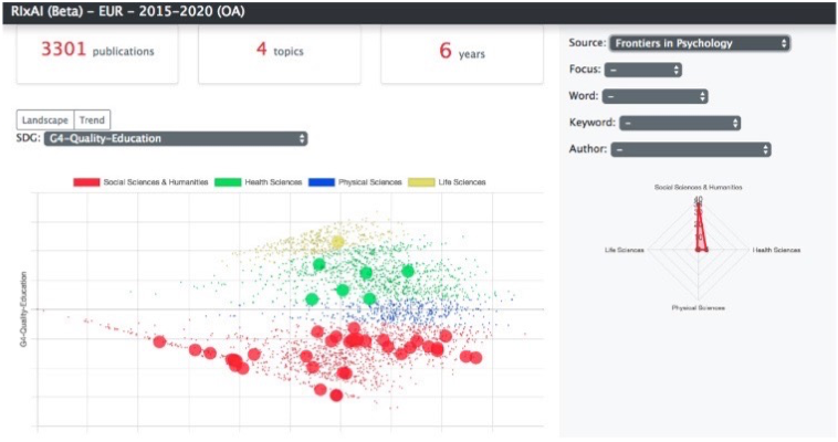
Tung Tung and Bijan created their first dashboard using a set of Open Access data from Scopus —about 3,300 articles from a six-year time period. The model worked successfully, but colleagues and stakeholders had a difficult time navigating the interactive dashboard and making sense of it.
The Final Dashboard – Built with Dimensions and Google Data Studio
A new approach to visualization was needed, and they chose to work with Dimensions and Google Data Studio. Going this route allowed for the existing model to work with new data available through the Dimensions API. The templates and configurable dashboard elements made it easy to get started.
“Ten types of interactive visualizations paint a clear picture about how EUR published research aligns with SDGs, along with a list of publications.”
The new dashboard produced excellent results. Ten types of interactive visualizations paint a clear picture about how EUR published research aligns with SDGs, along with a list of publications. Data uncovering funding details and Fields of Research is an added plus to the university.
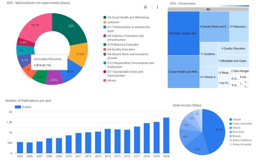
University staff can explore the SDG project using Google Data Studio. Clicking on charts, such as a year in the bar chart above, filters all of the other dashboard elements based on the selection.
Features in Dimensions added further value to the project. Citation data and Altmetric scores give insight to the popularity of the published research. A built in SDG classifier allows EUR to compare results of their model with the approach used by Dimensions.
For further details about the project, please watch the recording of the training webinar in which TungTung and Bijan talk about their work.
Find out what Dimensions can do for you
To learn more about how Dimensions can support your organization contact us and our friendly team will be happy to help.