One of the most refreshing aspects of the Dimensions API is that it is designed to be used on a daily basis by people asking questions about research, and not just by backend systems with complicated integration tasks (although it does this too). With the rise of data science, the ability for an analyst to process data in languages such as python is as important as a mastery of Excel. An analyst now expects to be able to easily query a research database, extract the information they need as a JSON object, and quickly incorporate the information back into their current project.
To illustrate how the new dimensions search API supports this new way of working, I thought it would be useful to walk through the process of using the API to build an institutional collaboration diagram. Institutional collaboration diagrams can quickly facilitate discussions on an institution’s collaborative practices and are a common request of research analysts. Without access to an API to retrieve the required information, the process of building collaboration diagrams can often be tiresome and repetitive.
Let’s get started.
Working through the steps required to build an Institutional collaboration diagram
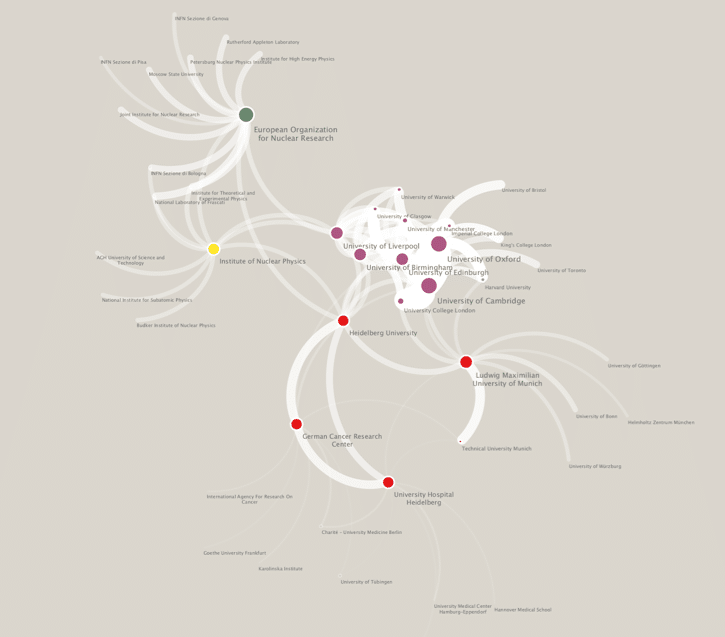
An institutional collaboration diagram is typically a network of research institutions that are connected by the number of publications that share common affiliations. For instance, between 2015 to 2018, Heidelberg University researchers published 835 papers with researchers from the German Cancer Research Center researchers. In a network diagram, these institutions would be connected by a line with a width proportional to 835 papers. Extending this further, based on the information that we can see in the Dimensions discovery interface, we can choose to construct a 1-degree network of the top 10 collaborators with Heidelberg University where the width of the edge between the two institutions is proportional to the number of publications co-authored.
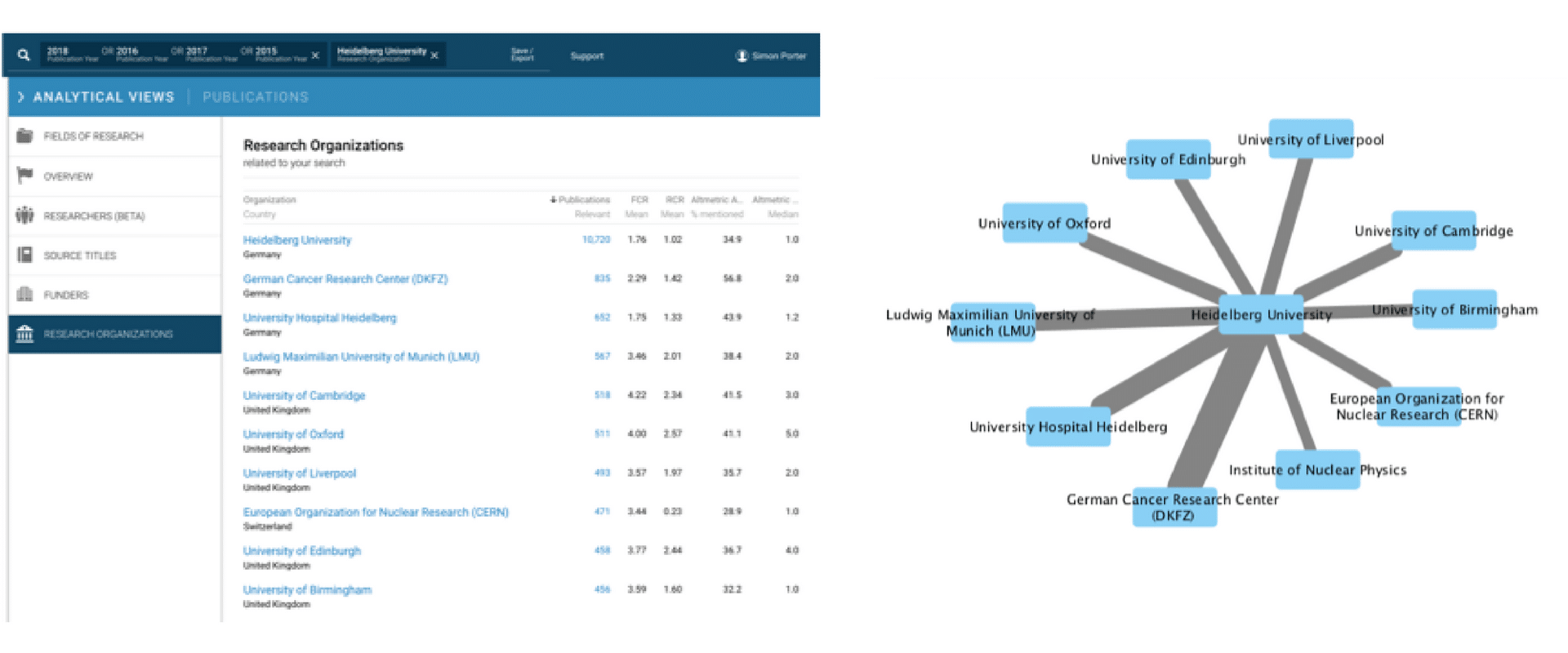
To build out the local institutional collaboration pattern around the University of Heidelberg, we can requery the Dimensions interface again and again to retrieve the top ten collaborating institutions for each of the connecting institutions. In doing so, we can begin to visualize a more complex multilateral relationships between institutions.
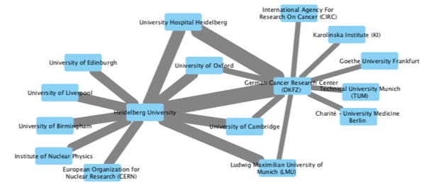
Of course, the number of queries that we need to undertake increases the greater the number of hops away from the University of Heidelberg we are interested in exploring. A 1-degree network from a source institution will require 11 queries assuming that we limit ourselves to only the top 10 collaborations for each institution. A 2-degree network could take up to 100 queries! Each query requires several steps, first to execute, and then to extract and merge the collaboration data into a single network file. For a 1-degree network, this activity would probably represent the better part of an hour of repetitive work for a dedicated analyst. Using the Dimensions Search API (and a small amount of python code) we can complete this activity in minutes, and create a scalable repeatable recipe for looking at far larger networks than it would be possible to create by hand.
Using the Dimensions DSL via the web interface
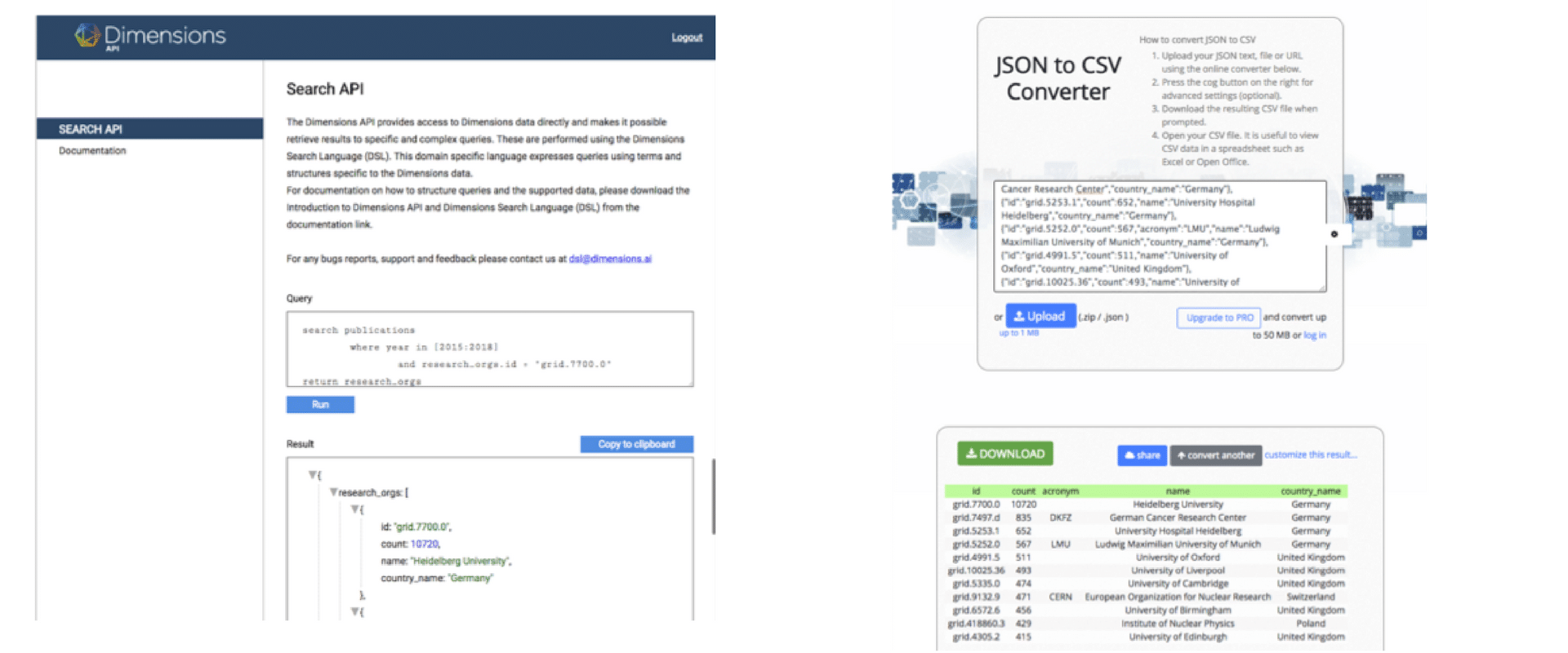
To start with, we can replicate the Dimensions query that we made above using the Dimensions Search API. Once we have logged into https://dsl.dimensions.ai/, we can express the University of Heidelberg collaboration query as:
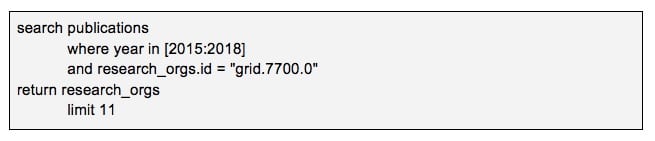
(we can look up the GRID id for the University of Heidelberg at https://grid.ac/institutes)
This query returns a json object that lists out exactly the same publication counts that can be found in the front interface. For many analytic tasks, it is useful to convert these results back to tabular form using a JSON to CSV converter like https://json-csv.com/
So far we have replicated the same manual experience that we get on the front end, with the Search API. What remains is to script these steps using a programming language such as python.
Using the DSL with python
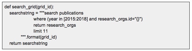
To use the dimensions search API with python, we first need to create a function called “dslquery” that acts like the web interface – it handles authentication, submits queries and returns results in JSON format. As the code for doing this just needs to be written once, it is useful to put this in a separate file that can be imported into all of the scripts that you will write to query the DSL.
![]()
Next, we need to parameterise the query that we used above so that it can be generalised for any research institution. We achieve this by wrapping the query as a function that takes a grid institutional id as an input.
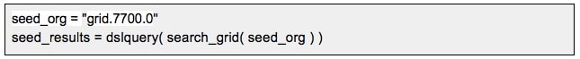
We then run the query once to get the list of Institutions that we wish to base our network on.
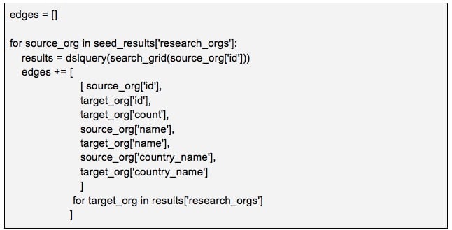
To create our network, we loop our way through the seed results to build out the top ten Institution edges for each of the institutions identified. This loop will submit 11 queries to the DSL, one for each institution.
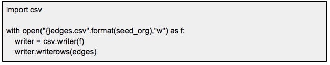
From here, all that is left to do is to is to export the results to CSV, and then visualise these results in a network visualization tool such as cytoscape.

Going further
Having established the recipe for creating institutional collaboration diagrams, it is easy to create slight modifications that limit the network to a particular field of research or expand the network to all institutions in a country. You could also represent the collaborations on a map by retrieving the longitude and latitude for the institution from the GRID JSON service. (Try https://grid.ac/institutes/grid.7700.0.json as an example)