Dimensions and Leiden University’s Centre for Science and Technology Studies (CWTS) are pleased to announce a new collaboration that permits analysis of Dimensions data in CWTS’s popular VOSviewer scientometric network visualization software.
Dimensions users can now download structured publication data from Dimensions and easily import it into the freely available VOSviewer software to visualize relationships between publications, authors, journals, institutions, and countries.
- Funding agencies can use these visualizations to identify emerging research areas, based on clustering and overlay visualizations.
- Universities and departments can use VOSviewer to trace knowledge flows from their publications to institutions and countries throughout the world.
- Journal publishers and researchers alike can use Dimensions-powered network visualizations to identify high-impact authors to approach about collaboration opportunities.
It just takes three easy steps.
Step 1 – Run a Dimensions search and export the results
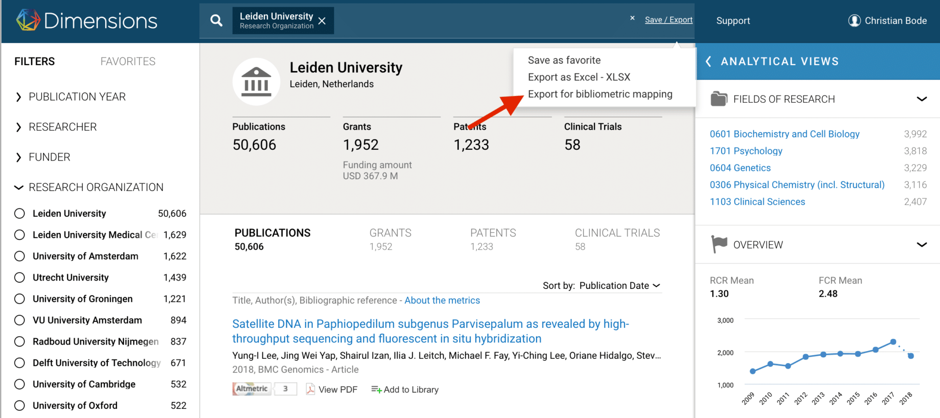
Fig. 1: Dropdown with option to “Export for bibliometric mapping”
Run a search in any version of Dimensions–the free Dimensions webapp, Dimensions Plus, or Dimensions Analytics–and on the Search Results screen, you’ll have the option to “Export for bibliometric mapping.”
Step 2 – Create a new VOSviewer “map”
Next, open up VOSviewer. To use Dimensions data to create a map (visualization), click the “Create” button in VOSviewer. The “Create Map” wizard will open. At the first wizard prompt, select the second option (“Create a map based on bibliographic data”). In the next step of the wizard, go to the “Dimensions” tab, where you can upload a Dimensions CSV file to use as the basis of your visualization.
Step 3 – Analyze and visualize your Dimensions data
You’ll then receive a series of prompts from the VOSviewer wizard, which will allow you to do different types of analyses and mapping. This co-author network is an example of the kinds of maps you can create with Dimensions data in VOSviewer:
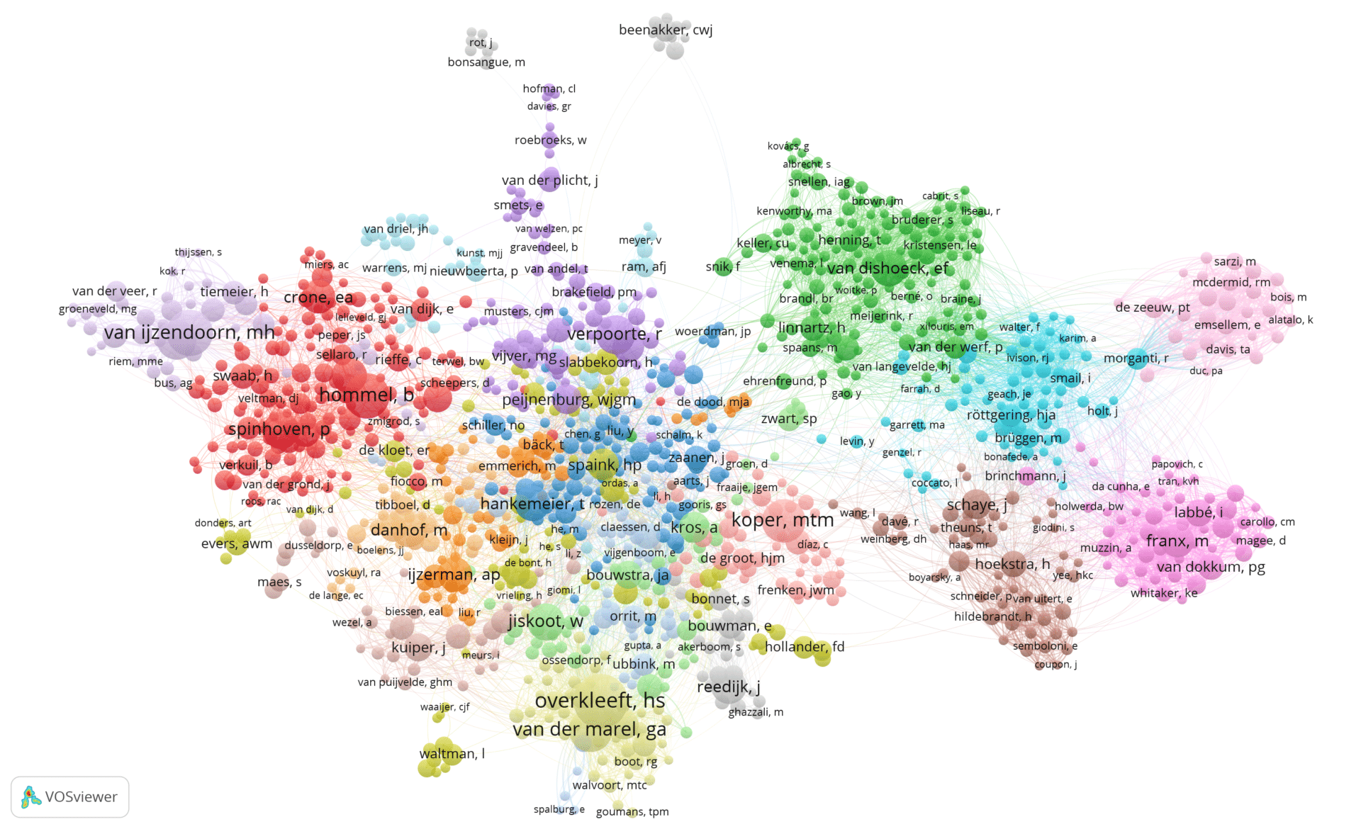
This map shows the network of co-authorship links between 1,218 authors of publications from Leiden University–either by Leiden University researchers or those that have co-authored with them.
The “bubbles” represent authors. The size of an author represents the number of his or her publications. Lines between authors represent co-authorship links. Two authors between whom there is a line have co-authored one or more publications. Authors that have co-authored also tend to be located close to each other in the map.
Colors indicate clusters of authors that are relatively strongly connected by co-authorship links. The map makes visible the different research communities at Leiden University as well as the connections between these communities. For instance, the authors in the right area of the map are astronomers, while the authors in the left area of the map are social scientists. Ludo Waltman (co-creator of VOSviewer) is located in the bottom left area of the map, together with a number of his colleagues from CWTS.
You can create similar maps in VOSviewer using Dimensions data to understand co-authorship patterns, interdisciplinarity, and more.
To get started analyzing and visualizing your own datasets, create an account on Dimensions.ai, download VOSviewer, and begin exploring today!
Want to see more content like this? Sign up for news and updates from Dimensions